Let's make a font that lets us type a letter with an outline shape defined by the SVG path "", which is a neat way to say "it looks like a rectangle with a smaller rectangle cut out of it". We're going to have this shape sit in the spot of the tilde, "~", but because it might be more useful to have it automatically show up when we type a full word (like you can see expertly demonstrated over at symbolset.com), we're also going to make it show up when we type the word "custom".
As it so happens, this page is running a JavaScript library that can build custom fonts like the one just suggested, and said font has actually just been built by your browser. The library also loaded the resulting font as a webfont for this page (using a @font-face CSS rule and a styling class), so let's see what your browser made of it!
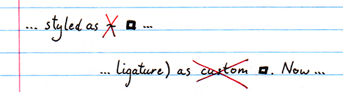
The character ~, with our font applied, is now styled as ~, and the string "custom" is similarly styled (as ligature) as custom. Now, because this is essentially just in-font magic, copy-pasting the first rectangle should lead to you pasting the plain string "~", and copy-pasting the second rectangle should lead to you pasting the plain string "custom".
So, we have a font that models "a shape", and we have a label that we can type that magically gets converted into that shape. Basically, this is how every (good) icon font that you've ever seen works. But, how do they work? Let's dive in.
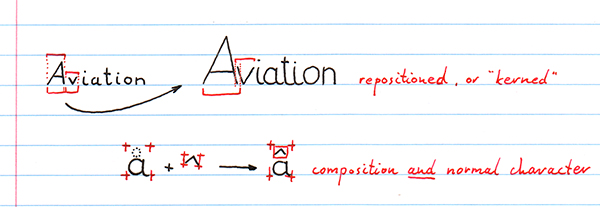
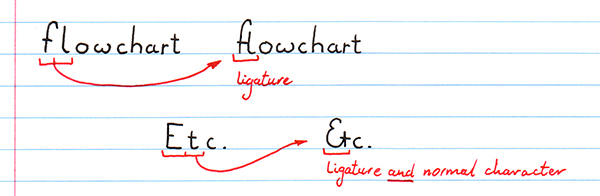
While letters like é exist "on their own", they can also be written as the sequence [e´]. Intelligent fonts can actually either reposition the accent, so that the combination looks like an é, or they can perform a "ligature" substittion and replace the two characters [e]+[´] with the single character [é].
The following two tables are the kind of thing you would normally see in a hex editor, if you were to load up a (really) small font file. On the left we see the font's bytecode in hexadecimal numbering, and on the right we see the "as best as we can show it" table of bytes-as-letters (based on the iso 8859-1 code page). You can make out some words on the right like "name" and "License-free", but for the most part it kind of looks like gibberish. However, if you know how to read a font, this view holds no secrets: everything the font can do is right there, just written in a different language. It's not even obfuscated or compressed, it's literally just a different way of writing down a graph of numbers.
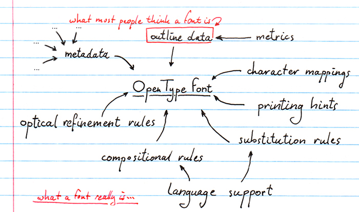
First of all, a little primer on how OpenType fonts work. A font file is actually a collection of "tables", each describing a different aspect of the font. Some contain information on the font's name, license text, who made it, etc. and some contain metrics information, like what the overall character height is, how many letters are in the font, etc. Of all the tables in a font (and there are a fair number), typically only one table will contain what you might think of as actual letters. In the little font on this page, that's the "CFF" table (a "compact font format" table). Looking at the font's bytecode we can tell (that is, if you know how to read it) that of the 1372 bytes that our font takes up, only 211 bytes (D3 in hex, see if you can spot it) are taken up by the CFF table. That's... really not that much. What on earth is all the rest for?
The CFF table is to an OpenType font what a typeface is to a book: essential, but really not the part that makes a font special. What makes OpenType fonts special is that they describe every aspect that you might be able to think of when you think of putting letters together to form words. In addition to the obvious "this is what letters look like" information, OpenType fonts also specify things like the name of each letter that is available in the font, how much of the Unicode standard the font implements, which horizontal and vertical metrics apply to which letters, exactly how the letters are arranged inside the font so that they can quickly be read out, what kind of font classifications apply (is it a fantasy font? is it bold face? is it fixed width? etc), what kind of memory allocation a printer needs to perform in order to be able to even load the font, etc. etc. etc.
For instance, the biggest table in this font is the "name" table, which contains all the strings that describe things like the font name, the font family name, who made it, which version it's on, what (simplified) license applies, who owns the copyright, which preview text to use in font previewers, and more such things. This table is a whopping 519 bytes, almost half the font! The reason it's so big is that even though computers these days don't really care about which operating system you use, OpenType fonts still "have to" contain strings in both "Macintosh" and "Windows" format, which really means ASCII format (which is a 7-bit string format, with one byte per letter) and UTF16 (which uses two bytes per letter; unfortunately for characters that are also in ASCII, the first byte is always a zero byte, so it's basically "ASCII with zero-padding"). As such, a string like "Version 1.0", which is 11 letters (including the space) will take up 11 bytes encoded as a Macintosh string, but because it also needs to be recorded in UTF16, we get an additional "0V0e0r0si0o0n0 010.00" —with zero-bytes in front of every actual letter— which means having an additional 22 bytes. If we didn't have to encode the data twice, we could do without almost two thirds of the table. While it's good that OpenType is about describing everything, sometimes it's a little over the top.
Of course, another reason the name table is so big is not because it's genuinely big, but also because the font itself is actually so very small. It only contains seven letters ("c", "u", "s", "t", "o", "m", and "~"), so the actual font data is small, but in a normal font the name table will generally be much smaller than the three most important tables an OpenType font can have: the cmap table, for mapping characters that you might type for font-interal ids, the GSUB table, for handling glyph substitutions, and the GPOS tables, for handling glyph positioning in relation to each other.
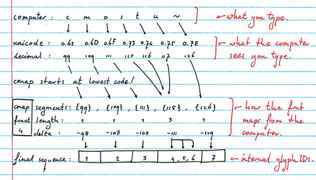
Fonts actually don't contain letters. This sounds a bit weird, but they don't. They contain glyphs. The letter 'A' is a glyph, but so is the symbol "." (the full top), and so is the diacritic mark "^" (the circumflex). Fonts will have implementations for some glyphs, but not for others, which poses a problem: fonts simply encode all glyphs that they implement in a long continuous list, numbered glyph id 0, glyph id 1, glyph id 2, etc. so when you type the letter "A", which usually has a decimal code 62, the font might have the glyph for that letter in font-list-position 1. Or 120. Or 17402. In order to make the switch from the "used by the computer" code to the "used specifically in this font" code, we have the cmap, or "character to glyph mapping", table.
The cmap table is actually a collection-of-collections. Rather than only having one way to map outside character codes to in-font character codes, there are a fair number of encoding schemes that can be used depending on how fragmented or ordered the font implements its glyphs. For instance, if the font is an old style 256-character font, then a cmap "format 0" subtable can be used to model the straight 256 different mappings, one for each character. To find the glyph id for the letter A, for instance, you would simply look up format0[62], where 62 is the numerical code for the letter 'A'. Done.
However, if the font models Unicode blocks (and Unicode has a *lot* of characters. Over a million by last count), and it only encodes some of those, with gaps in between sequences of implemented characters, it might use a format 4 or format 12 subtable. Format 4 lets you encode the implemented characters as "segments" of continuous codes, so that encoding codes 25,26,27,28,29,43,44,45,46,47,120,121,122 can be done using three segments, {25,29}, {43,47} and {120,122}. Some extra values are used to ensure that, while the character codes have gaps, the glyph ids they map to are continuous, so the three given segments might map to glyph ids {17,21},{22,26},{27,29}.
There are in fact currently nine different subtable formats available (formats 0, 2, 4, 6, 8, 10, 12, 13, and 14), all offering different ways to efficiently encode character ranges with specific properties. Plus, and this is the collection-of-collections part, you don't have to pick just one subtable to "explain" a font's characters. You can use a format 0 subtable for the first 256 characters, a format 4 subtable for the remaining two byte Unicode range, and then a format 12 subtable for the remaining 4 byte Unicode range. To make things even more descriptive, cmap tables are also keyed on platform and language, so you can have one subtable for Macintosh character codes, from a specific input language, to in-font glyph ids, and another for Windows character codes, from a specific codepage, to in-font glyph ids.
The more complete a font is, the larger the cmap table, and the cmap subtables, will be.
A font with GPOS (and in older OpenType fonts, the "kern" table), can make sure that letters are positioned correctly; both in terms of what looks nice (like moving a V a little closer to A in "AV", so that it doesn't look like there's "too much" space between them) but also to ensure text is actually correct, like forming the Vietnames letter ở by combining the base letter "o" with the two diacritic marks required to make it the correct letter.
The GPOS table can in fact perform these (re)positionings in quite a few different ways. It can: adjust position of a single glyph, adjust the position of a pair of glyphs, attach cursive glyphs, attach a combining mark to a base glyph, attach a combining mark to a ligature, attach a combining mark to another mark, position one or more glyphs in context, and position one or more glyphs in chained context.
A font can also require glyph substitution, for which the GSUB table is used. For instance, a font that uses GSUB might contain two different sets of the numbers 0 through 9, one set for "normal typesetting", and another for "when historically used versions" are required. In "the old days" you would need to use two separate fonts, with the old-style number font applied to each number in your text, but with a modern OpenType font, the font itself can do the substitutions and you don't need to worry about whether all the numbers got styled correctly. However, the GSUB table can also be used to substitute single letters, or multiple letters, with other single or multiple letters, and it can be used to change what letters look like depending on where in a word they are. That might sound weird, but Arabic has four different shapes for each letter, depending on whether it's used on its own (i.e. in isolation like quoting the letter "A"), or used at the start, middle, or end of a word. Good luck trying to do that with a bunch of separate fonts for each of the positions in a word.
Our little font only has one real letter, so it doesn't use a GPOS table (what would we reposition?) but the cmap table for mapping the seven letters "c", "u", "s", "t", "o", "m", and "~" takes up 106 bytes (thanks to being highly fragmented character codes), and the GSUB table, used only to replace the string "custom" with the glyph for "~", clocks in at 98 bytes. That's almost half the size of the CFF table. We kind of know why the cmap table is so big (the proportional size goes down the more letters we actually implement, to fill in the gaps that this font very clearly has), but why is the GSUB table so big?
One of the more important aspects of modern fonts is that they're not just for "styling letters", they are for styling full strings, for specific scripts, in specific contexts, in a way that lets a font specify what to do in case of different scripts and different contexts. Things you might think you would need to specify in a word processor are actually things that fonts, not the word processor, can do entirely automatically.
For instance, Chinese and Japanese both use the "CJK Unified Ideographs" set of characters defined by Unicode. However, while they use the same characters in principle, they don't always look the same in the two languages. As such, a modern OpenType font can contain instructions to apply certain rules when the font is used in a Chinese script context, and use other rules in a Japanese script context. Even within the same script, we might have different ways that text needs to be style. In keeping with Asiatic languages, both Chinese and Japanese can be written either horizontally (from left to right, one line below the previous), or vertically (from top to bottom, one line to the left of the previous). Depending on which writing mode the font is used in, the character metrics will be different. So for GSUB and GPOS tables, the idea is that "things to apply for styling" are encoded as "lookups" (for instance, the GSUB lookup type 4 encodes how to turn several letters into a single other letter, like turning the letter sequence "custom" into a rectangle), and "features" can link to one or more lookups; features marked as "liga", for instance, encode the notion that "there are ligatures available in this font", and then point to specific lookups that can be used to perform the actual substitutions. Finally, fonts will have a list of supported scripts (including a "DFLT" script for when nothing else applies) which can each indicate that one or more features should be active. You might want to have small-caps replacements active for English scripts, for instance, but not for Greek and Coptic.
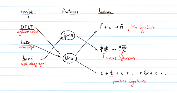
In this simple font, just to get the word "custom" replaced with our little rectangle, we need have a GSUB lookup defined, with a feature called "liga" that points to that lookup, with a featureset that contains just that single feature, and two scripts —the DFLT script as well as a "latn" script, which covers most western written characters— that both point to the same featureset. Clearly, the script/feature/lookup idea is pretty useful, but it's also pretty complex, and for simple things like a single substitution rule, perhaps a little overkill.
Another consideration that OpenType fonts allow is which kind of outline description to use. You may have heard of TrueType fonts, especially contrasted to OpenType fonts, but actually TrueType is to OpenType what Ford or Porsche are to cars: OpenType is "the thing", and TrueType is simply one flavour of OpenType font. The main other is the "Type 2" or "CFF" flavour.
What's the difference? TrueType was historically Microsoft's way of modeling outline shapes, and is a relatively straightforward way to describe lines and curves that are necessary to draw letters. It's easy to define shapes in, but its simplicity unfortunately comes at a cost: it's also not a very efficient way to describe outlines. CFF, on the other hand, has a very rich instruction set for describing outline graphics using Adobe's "type 2 charstrings". These things are extremely efficient at describing rich shapes, but they can also be terribly complex. Generally if you font models relatively few characters, or their shape doesn't require a lot of complex outline graphics, then TrueType flavoured OpenType fonts are a good idea. However, for fonts with very large character sets (such as East-Asian fonts) or fonts with highly detailed graphical characters, CFF flavoured OpenType fonts might be a much better idea.
Despite using a relatively simple graphic for our font on this page, we're still using a CFF font. Why? Because doing so lets us see more about how fonts work than if we used TrueType outlines. In fact, while TrueType data is mostly just a table of outline instructions and a second table for resolving character codes to 'where in the outline block is the data for this character' (the "glyf" and "loca" tables, respectively), a CFF block is a full font in an of itself. While it was never designed to be used on its own (always meant to be inside a wrapper that holds all the meta data), a CFF block pretty much has everything that would qualify it as a font: it knows which characters it supports, it has outlines for them, it has general metadata on character metrics, font name and version, and even whether it's an ultra thin or bold font. That makes it far more interesting to look at, in addition to using the Type 2 charstring instructions for outlines, which are almost like a programming language for graphics. Come to think of it, scratch that "almost". Type 2 charstrings are really, really powerful.
Let's take a closer look at that CFF table, because it's an entire font on its own, and unlike OpenType fonts, is all about describing as little as possible to make sure no space is wasted. Combined with all the metadata already stored in the OpenType tables, this might very well be a winning combination.
Every CFF definition consists of a number of fixed sections, each with as few bytes as, reasonably, possible:
The CFF specification in fact allows for a number of variations here that will efficiently encode different kinds of fonts (e.g. fonts that conform to a default character set, freeform fonts like this page's tiny font, huge unicode-spanning fonts, etc.) and lets you be either very verbose in terms of how accurately your outlines need to be rendered depending on the point size they're being rendered at. Effectively, CFF is an elaborate way to organise everything you need to make sure the Type 2 charstrings get rendered exactly the way the typeface designer(s) and font engineer(s) meant them to be rendered.
Did I mention that Type 2 charstrings also let you write PostScript inside of them? Because just in case the designers and engineers didn't have enough power yet, you can also say "okay, you know what, we need to do things that Type2 can't do on its own. Here is a program that will actually do that thing. Run it when you read in this character". There are of course some safeguards here: the PostScript instructions that you can use don't let you do things like open files, it's just for manipulating numbers, and you can't do infinite recursion, your program stack can only contain 48 "things" before it's full, but it does mean you can do an insane amount of plotting instructions simply by knowing how to implement them in PostScript. Make the PostScript program a global subroutine, and now all your characters can make use of it. Fonts really are amazingly rich things.
We can also look at the font as a structured object, similar to a JSON or C "struct". While this isn't necessarily a very useful view, it's actually really useful when you're debugging a font. I'm note quite sure how to make this view work for you yet, but I'm working on it!